Product
This year, I made a lot of changes to the design and brand of Portrait, particularly in the creation of repeating columns/sections and in the updating of the folio. Hover over each old design to reveal the new one!
Cover
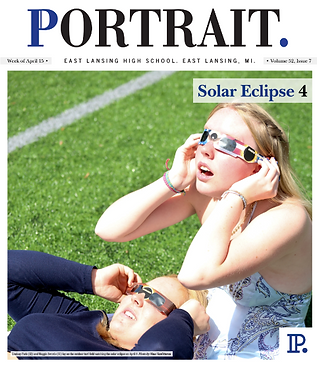
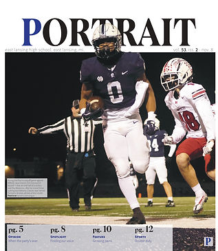
The cover was one of the biggest changes I made this year. I changed the font of the masthead to make it more modern, moved the "glossary" to the front, and added a cutout to overlap with the masthead. I got the inspiration for the overlapping outline part from the USA Water Polo Instagram's player profiles that they made for the Olympic teams this summer.
First Page
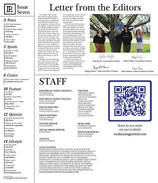
Since we moved the glossary to the front, there was a lot more room on the inside cover. So, we added a news photo story for every cycle. I also redesigned the staff box, and got rid of the unnecessary (and giant) QR code
_page-0001.jpg)
Folio
This is probably the design change that I am the most proud of. I didn't even know that the folio was something that we were allowed to change, and this one small change has made the entire paper look so much more elevated. The font of each section name is the same as the font for the masthead, and the design credit matches the new byline.
Repeating Columns
In order to make the whole writing and designing process easier, we added several repeating columns/sections this year, with the headers for those all matching design-wise. These columns include:
-
Photo story
-
Athlete of the Month
-
Small mini-game
-
Recipe
%20(1)-images-1.jpg)
%20_page-0001.jpg)
_page-0001.jpg)